MEMBER PERSONALIZATION
Redesigning a 27-million-member portal from a transaction-oriented structure toward a personalized, member-relevant experience.
The Problem
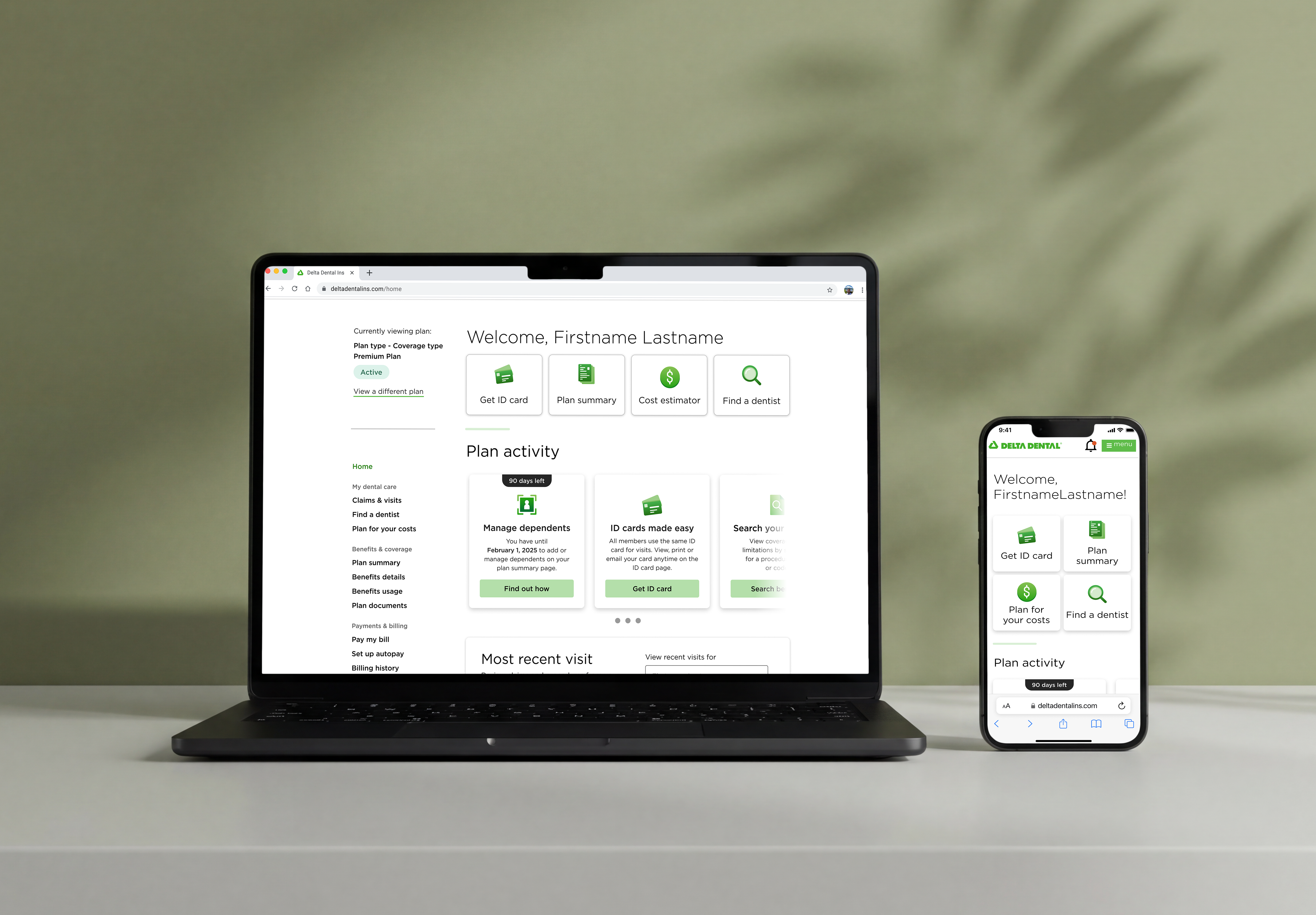
The member portal served 27 million people but was organized around the system's structure rather than the member's situation. There was no existing roadmap, no research foundation, and no shared definition of what personalization would mean for this product.
The Approach
Redesign the dashboard to orient members around their own situation, surfacing what was most relevant to each member based on plan type and behavior rather than exposing every available action equally.
Process
I brought a personalization concept to the company hackathon before any formal direction existed. The goal was to surface the problem space early and build shared understanding before roadmap conversations began.
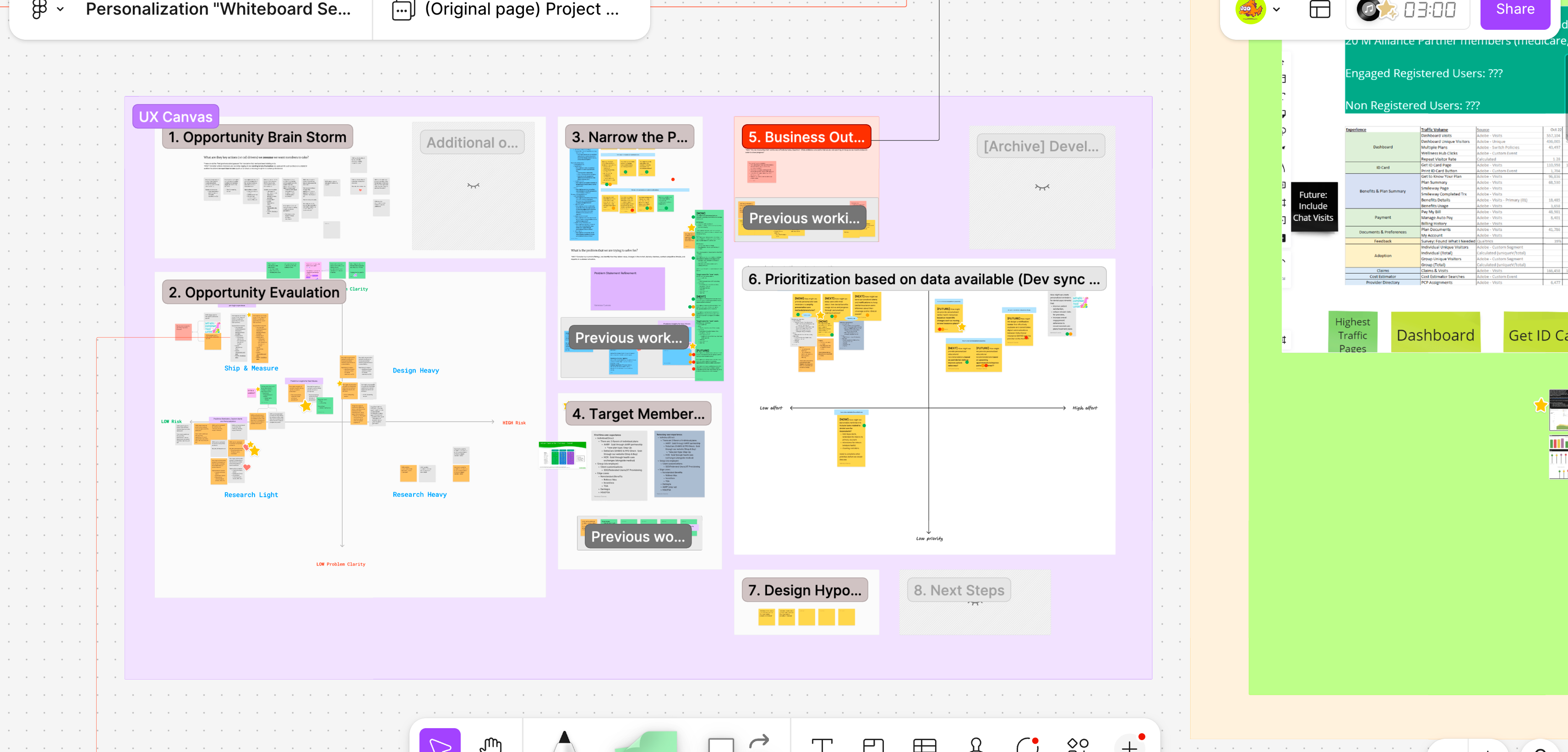
I co-authored a three-phase Personalization roadmap with the Group Product Manager and PM across three iterative versions, grounding each initiative in member research, testable hypotheses, and KPIs. Each version refined how the portal could shift from exposing system capabilities toward surfacing what was relevant to each member.
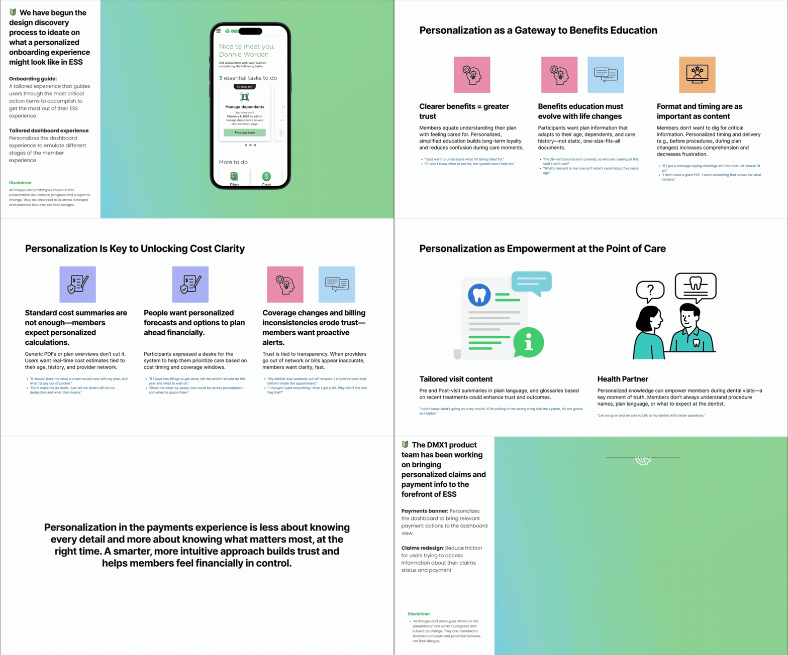
I built a prototype of the personalized dashboard and presented it to stakeholders across the organization to validate the direction, surface constraints, and align on priorities before engineering was involved. The feedback shaped what shipped first.
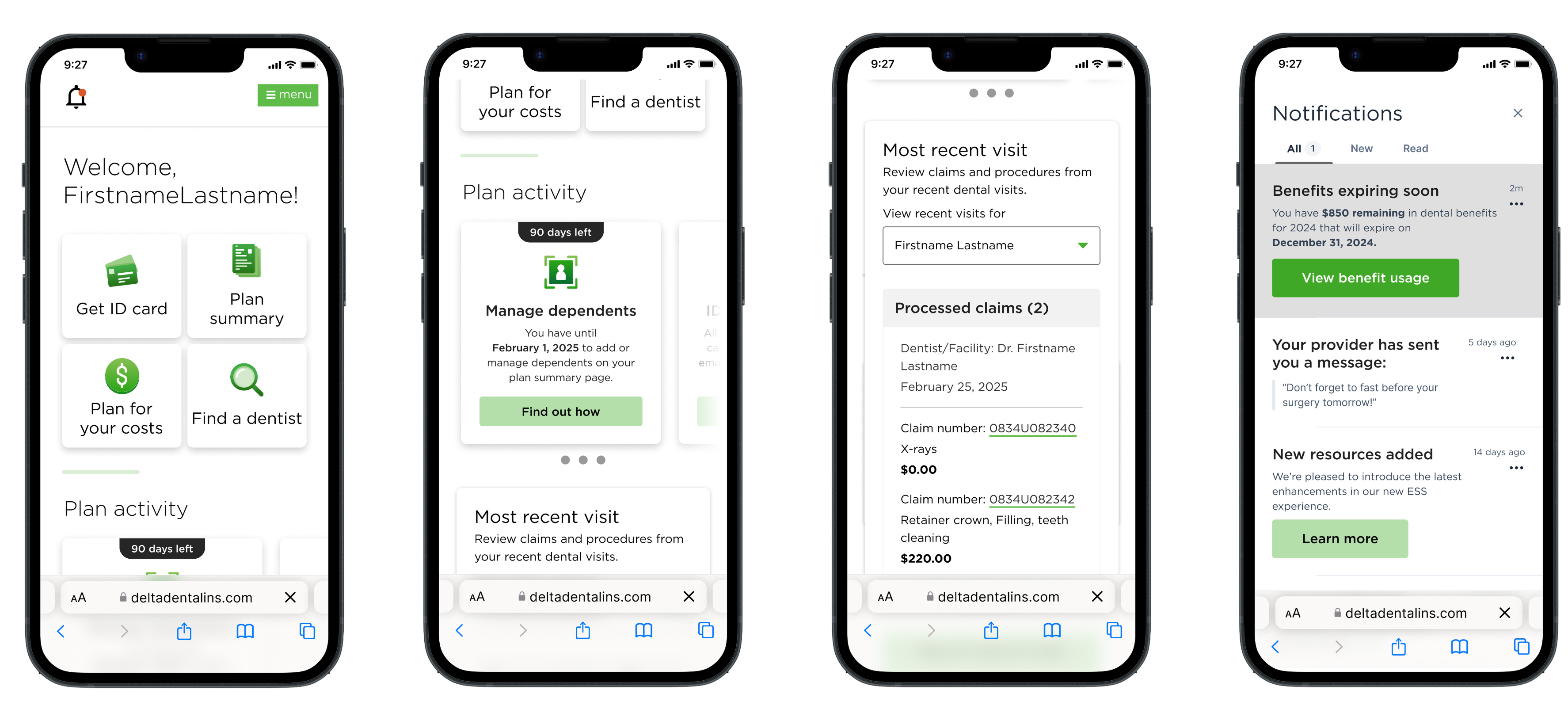
Each feature was researched and validated independently. I tested Figma prototypes with real members through UserTesting, iterating on flows, copy, and interaction patterns based on observed behavior before handing off to engineering. VOC data, session analytics, and member interviews with the UX researcher informed each scoped initiative.
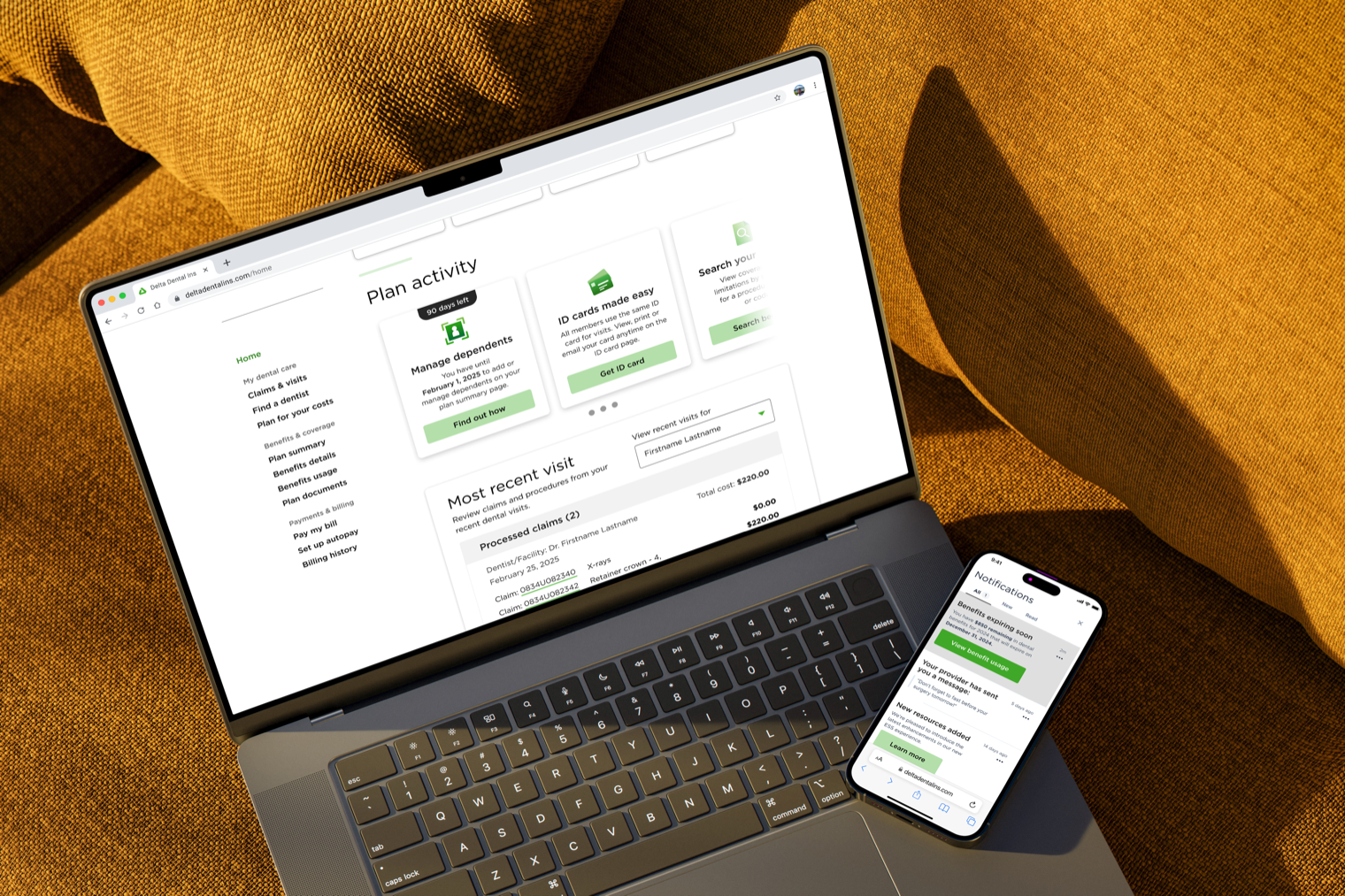
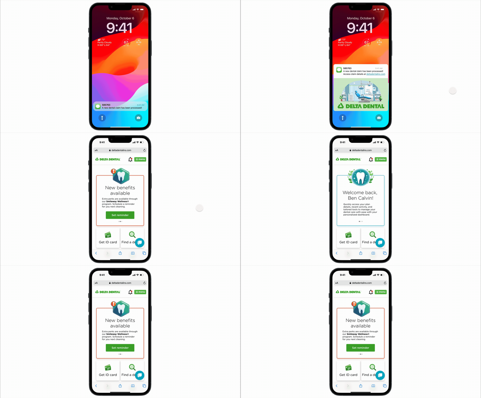
Three initiatives shipped incrementally against the Personalization roadmap: an Onboarding Guide, a Notification Center, and a Claims Widget redesign. Each launched fully instrumented. WCAG 2.2 validated with accessibility leads throughout, not as a final gate.
Key Decisions
Tradeoff: This meant forgoing the conventional top-down roadmap model in favor of using the hackathon to test ideas and build shared understanding before direction was formally committed. It created an early opportunity to present to the full organization before the roadmap was set.
Tradeoff: Less uninterrupted design time, but in exchange: earlier design reviews, daily standups to surface questions and bugs in real time, first-hand QA, and on-demand support between design and engineering in both directions.
Tradeoff: Personalization by behavior and plan type, not assumption. Instead of designing for a middle user that doesn't exist, we designed for two real scenarios by plan type: first-time members who needed orientation and returning members who needed what mattered surfaced faster.
Outcome
The +21% web app login growth reflected a shift in how members were choosing to engage — increasingly through mobile, a pattern that shaped interaction decisions across all three initiatives.
Reflection
The most significant shift in this project was framing: moving from what the system could do to what the member needed to do. Co-authoring the roadmap as a designer required grounding each phase in research and testable hypotheses rather than aspiration, which kept stakeholder alignment stable across multiple iterations.